 03.05.2018, 18:12
|
#1 |
|
Участник
|
stoneridgesoftware: 5 Simple Steps to Create Report Page Tooltips in Power BI
Источник: https://stoneridgesoftware.com/5-sim...s-in-power-bi/
============== Report Page tooltips is a really cool feature in Power BI that was incorporated in the Power BI March 2018 update. I’ve tried to replicate this in a few other reporting tools but they don’t have an out-of-the-box way of handling this, so I had to use JavaScript. With Power BI, you start creating custom report page tooltips in a new page size template called Tooltip. It’s really simple to create one! In my example below, I have a dashboard that displays sales by Geography. I’m going to add a tooltip to the chart so that when I hover over it I see another chart that shows me sales trends for that geography. Steps to create a custom report page Tooltip: 1. Create a new Page and call it whatever you like. I called mine “Customer Geography Tooltip.” Within that page navigate to the Format pane and expand Page Size. 2. Within Page Size select Type to be Tooltip 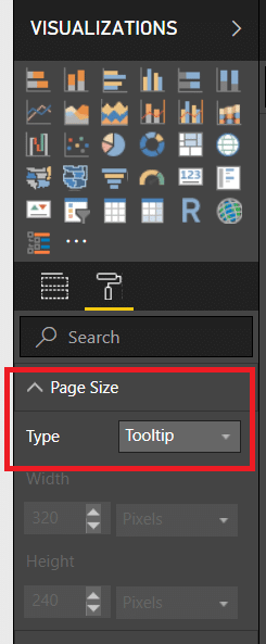 3. Next, go to the Page Information section and make sure Tooltip is set to on. 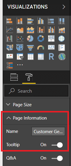 You’ll also want to make sure that the Page View is set to Actual Size. There is limited canvas space with tooltips so if you don’t have the actual size selected then your visuals might not appear in the tooltip. 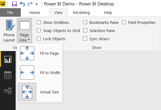 4. Now it’s time to start building your tooltip. Here is what I created. You can use any combination of visuals you like here. It’s just like creating a report in Power BI. 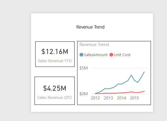 5. Finally, you’ll need to apply this to the chart you want to use this one. Navigate to your chart and select it. Under the Format Pane, there is now a section called. Turn the tooltip on and under Page select the tooltip you just created. 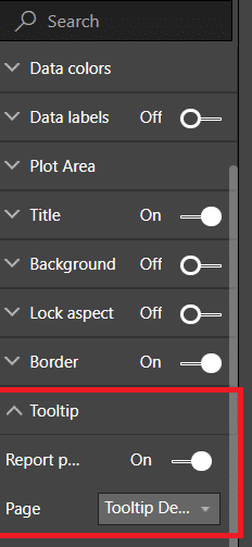 If you hover over the chart, you’ll notice the tooltip appears. If you go to a different bar you’ll notice that the numbers change. That’s because the tooltip is being filtered on the bar that you’re hovering over. 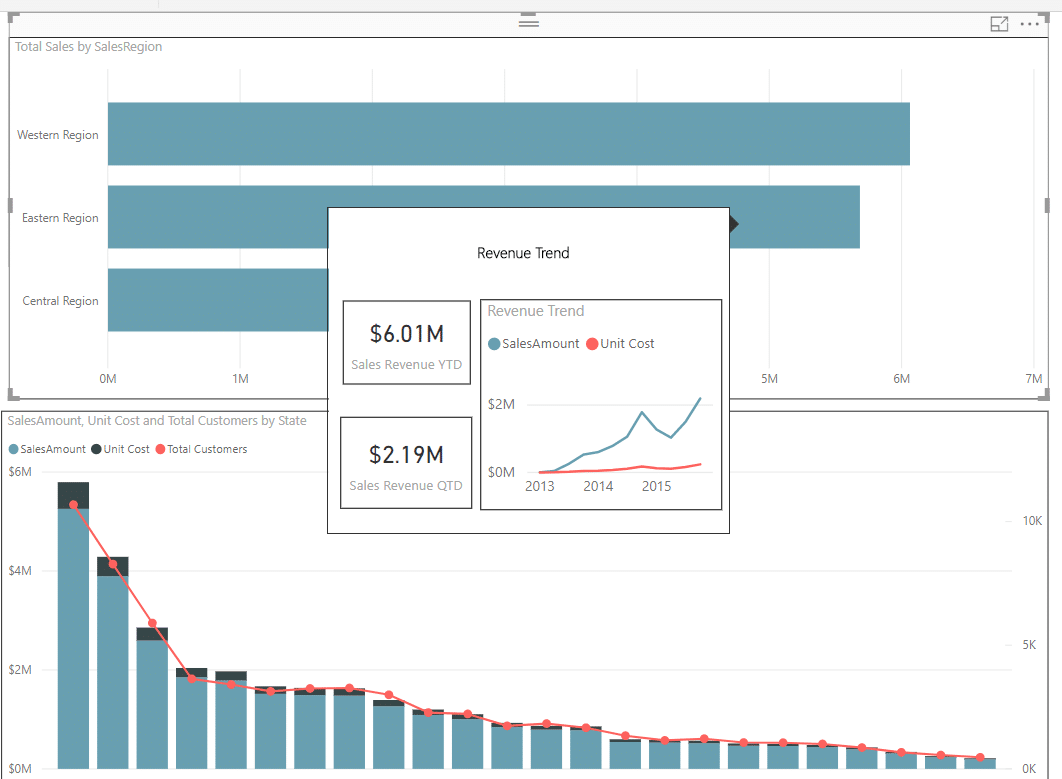 A few items to note are that this feature is currently in preview mode, is not supported when viewing reports in mobile apps, embedded environments, custom visuals, or publish to web. Источник: https://stoneridgesoftware.com/5-sim...s-in-power-bi/
__________________
Расскажите о новых и интересных блогах по Microsoft Dynamics, напишите личное сообщение администратору. |
|
|
|
|
| Опции темы | Поиск в этой теме |
| Опции просмотра | |
|


 Линейный вид

